Framing
As an independent restorer specializing in classical and archaeological cultural heritage, my wife required a company logo and corresponding business materials to enhance client acquisition and professional image. Many peers in the field present unprofessional corporate designs online, providing an opportunity to gain a competitive edge by visually representing restoration in an appealing and high-quality manner.
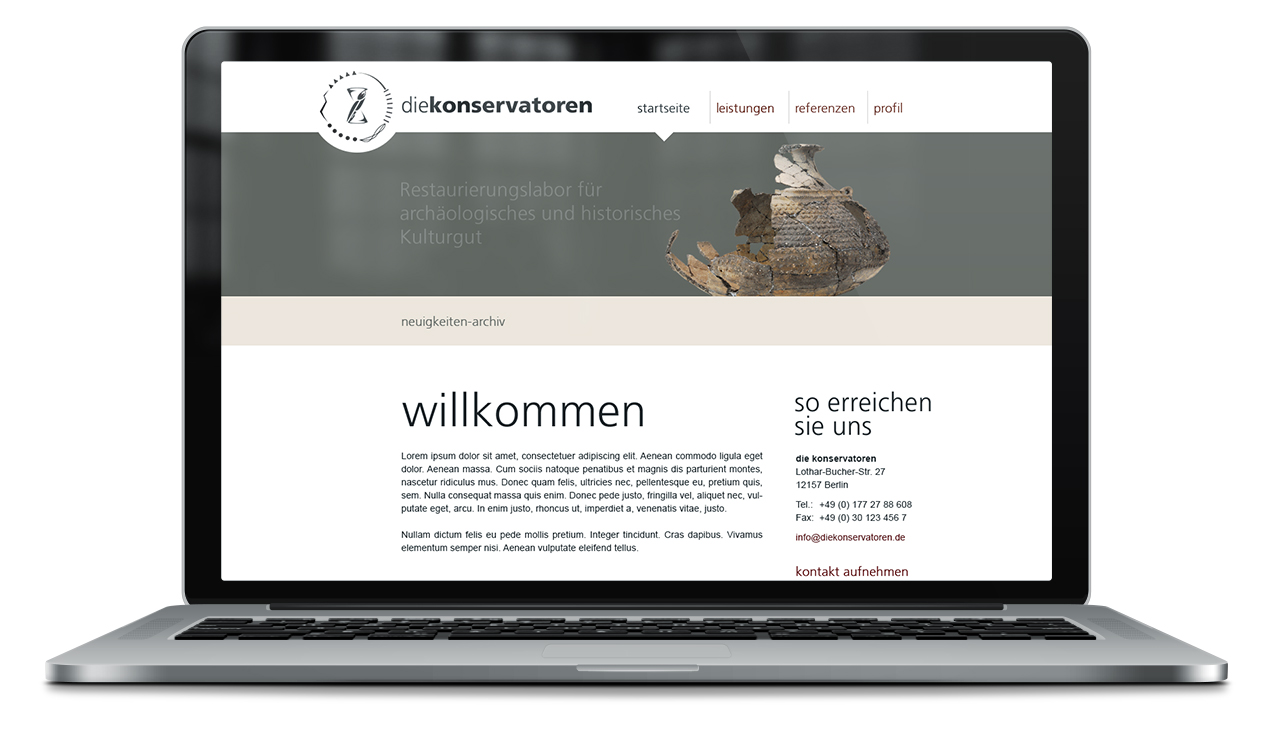
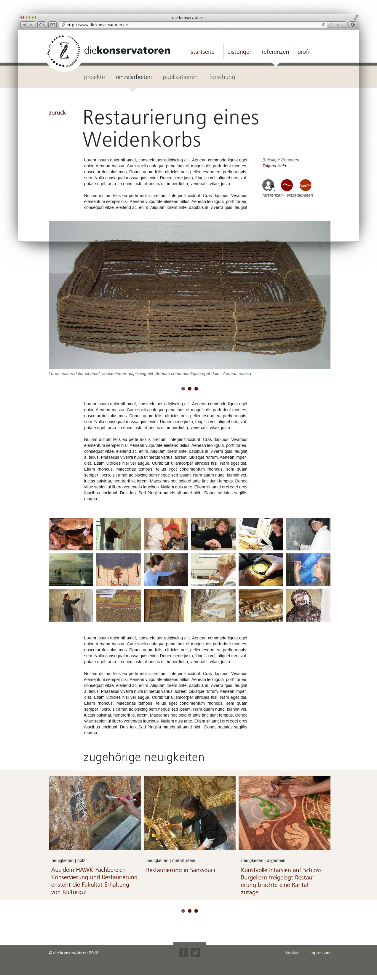
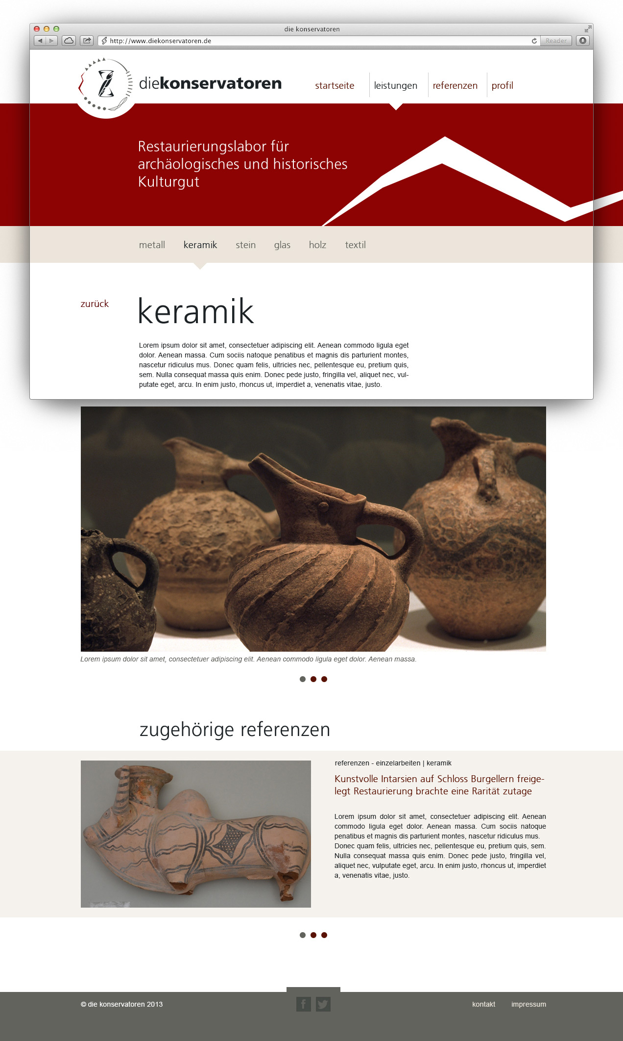
The project aimed to result a name, a logo, to commuicate the various materials and services covered in my wife’s portfolio, along with providing comprehensive business information, references, and contact details. The goal was to develop a website that effectively communicates these aspects to potential clients.
Outcome
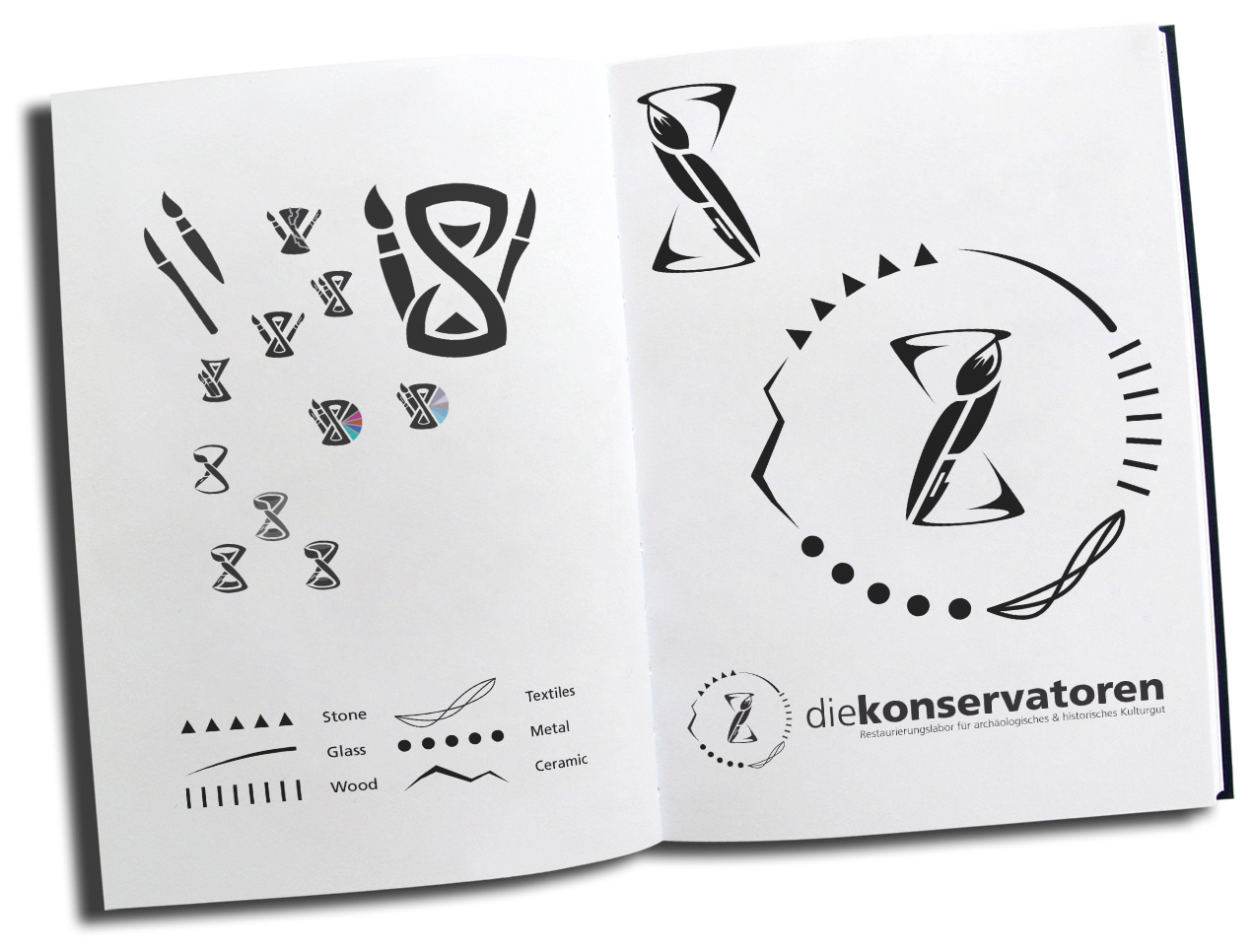
- Name “die konservatoren” suggests a professional team, tapping into niche SEO potential.
- The logo representing a self-restoring hourglass effectively captures the theme.
- Symbols for materials: Stone, Glass, Wood, Textile, Metal, Ceramic, used around the logo and as category indicators on the website.
- Customized WordPress website showcases services with each reference linking to related services and materials.
- Abundant photos and detailed documentation emphasize professional work.
- A lot of positive customer and colleague feedback was collected after release and the professional corporated design contributed to the success of the business.
Approach
In the logo design process, I brainstormed concepts capturing restoration themes, exploring various symbols and typography. After sketching and receiving feedback, I digitized the chosen design, focusing on coherence and visual impact. For the website, I meticulously planned its structure, wireframed the key pages and created first UI Designs, adding content and relevant visuals. Development involved customizing a WordPress theme, ensuring responsiveness and smooth functionality. Business materials were meticulously crafted to maintain brand consistency, with attention to detail in printing for a professional finish.
Learnings
- The logo effectively communicated the theme of restoration and conservation while being visually appealing and memorable.
- Website design focused on providing a seamless user experience, allowing visitors to easily navigate and discover services.
- Consistent branding across all materials and platforms reinforced the professional image of “die konservatoren.”
- Positive feedback from customers and colleagues affirmed the effectiveness of the design approach and contributed to the success of the business.
- Regular evaluation of website performance and customer feedback allowed for ongoing refinement and improvement of design elements and user experience.
- The extent of individualization of the used WordPress theme, led to increased maintenance efforts. Sticking to defaults and make use of child-themes help to work more efficient and reduce the amount of errors.